Case Study,
Greenfield disease Platform planning & Design
Disease Platform was a system UX project for Daiichi Sankyo
Where I designed a scalable platform for healthcare professionals, defining user access, platform logic, and workflows to balance regulatory compliance, content discovery, and professional engagement.
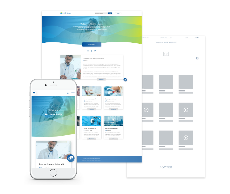
Disease Platform Images

Goal
Create a compliant and scalable platform that encourages healthcare professionals to register and engage with medical content, education, and events.

Impact
Established the platform's access model, business logic, and user flows, creating a trusted and scalable experience for healthcare professionals.

Success Metric
Clear visitor vs. registered HCP experience
Compliant access through HCP verification
Increased registration motivation
Scalable platform structure for future growth
Product Context & System Constraints
Daiichi Sankyo aimed to create a disease‑focused digital platform for non‑valvular atrial fibrillation (NVAF)—a chronic condition that requires continuous education, updates, and engagement from healthcare professionals.
The platform was designed exclusively for Dutch healthcare professionals (HCPs) and needed to balance:
Medical credibility and regulatory constraints
Controlled access to content (licensed doctors only)
Ongoing engagement through education, events, and direct communication
The Challenge
The challenge was not only to design screens, but to define a system that:
Differentiates access based on user type and verification
Supports multiple content types and interaction models
Integrates backend services (identity verification, email, meetings)
Encourages registration without blocking discovery
Role, Responsibilities & Design Scope
I was responsible for end‑to‑end system UX design, focusing on structure, logic, and experience coherence across the platform.
Responsibilities
Information architecture
Business logic definition
User roles & permissions
Sitemap and end‑to‑end user flows
Wireframes and high‑fidelity mockups
Cross‑functional alignment with product and development
Team:
Product Owner
UX/UI Designer (me)
3 Developers
Work Process

Business Logic & User Flows
Working closely with the Product Owner, I translated requirements into clear system logic and visual documentation.
Deliverables:
- Sitemap
- Backend interaction mapping (emails, meeting tools, verification)
- 11 detailed user flows
These flows served multiple purposes:
- Alignment tool with the client
- Functional blueprint for developers
- Validation reference during testing
They documented not only user actions, but also:
- System responses
- Automated communication
- Edge cases based on user type
Brainstorming with the team
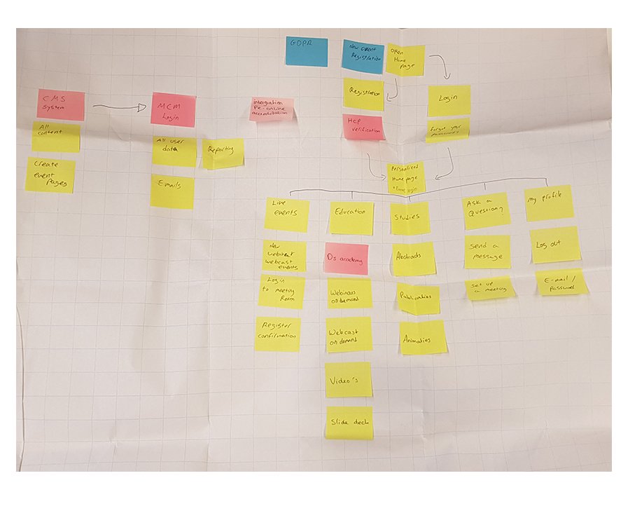
System Thinking, Defining Users & Access
A critical early step was defining who the platform is for and how access should work.
User Types:
1. Registered HCP
Licensed healthcare professional in the Netherlands
Verified via BIG number (Dutch medical license)
Full access to content, education, events, downloads, and meetings
2. Visitor
Any non‑registered user
Can explore high‑level content
Must register to access gated features
This distinction drove permissions, content visibility, messaging, and user flows across the entire system

Goal - Design a scalable disease platform that attracts healthcare professionals to register by:
1.
Offering trusted medical content
2.
Providing accredited education
3.
Promoting relevant medical events
4.
Enabling direct communication with medical representatives

Visitor
Has access to home page
Can access the one-on-one meeting with a representative from Daiichi

Registered HCP-health care professional
Has full access to all the website pages and features
Business Logic & User Flows
Working closely with the Product Owner, I translated requirements into clear system logic and visual documentation.
Deliverables:
Sitemap
Backend interaction mapping (emails, meeting tools, verification)
11 detailed user flows
These flows served multiple purposes:
Alignment tool with the client
Functional blueprint for developers
Validation reference during testing
They documented not only user actions, but also:
System responses
Automated communication
Edge cases based on user type
User Flows
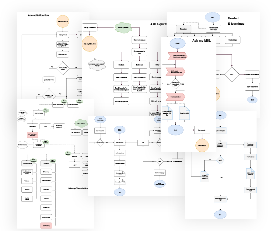
Key System Integrations
Backend connections included:
Email communication logic
Online meeting room integration
BIG number verification for licensed access
Each integration directly influenced UX decisions around feedback, messaging, and trust.
Wireframes & UI Logic
Open vs. Closed Experience
Open Home Page (Visitor)
Designed to attract healthcare professionals
Content is visible to build trust
Any interaction with content triggers registration
Closed Home Page (Registered HCP)
Full access to all content and features
Personalized messaging and clearer context
Direct entry points to education, events, and meetings
Although both user types see similar entry points, they follow different system flows depending on authentication status.
User Flows
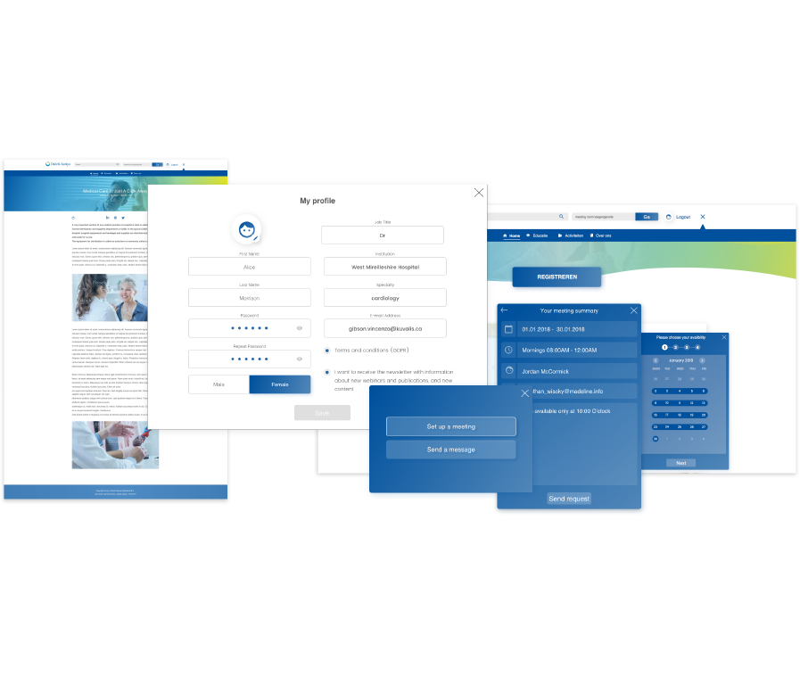
User Flows
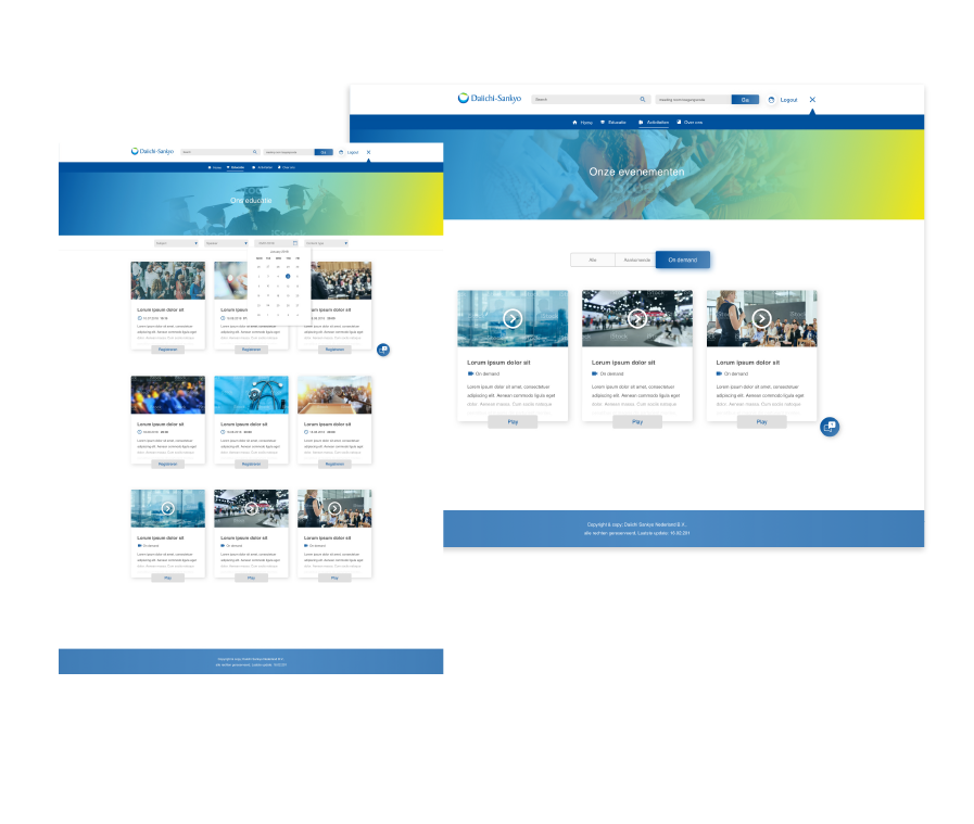
Education & Events as Engagement Drivers
Education
Accredited educational content allowing HCPs to earn mandatory points
A strong motivator for registration and repeat visits
Required clear UX around value, credibility, and access
Events structured into:
All events
Upcoming events (with countdown)
On‑demand (recorded past events)
Designed to support both real‑time participation and long‑term content value.
Impact
The final platform concept:
Clearly separates discovery from gated medical access
Supports regulatory requirements without harming usability
Encourages registration through real professional value
Scales across content, education, and events
Strengthens Daiichi Sankyo’s positioning as a reliable medical partner
Additional Features
My Profile
Personal profile management, including photo and editable details
Set Up a Meeting
Persistent call‑to‑action allowing HCPs to book online meetings with a Daiichi Sankyo representative
Article Pages
Logged‑in users can read, download, and share medical articles

Constraints & Trade‑offs
Designing a disease platform in a regulated healthcare context required balancing usability, compliance, and business goals. Several constraints directly shaped the system architecture and UX decisions.
Regulatory & Access Constraints
The platform was intended only for licensed healthcare professionals in the Netherlands.
Access to medical content and features required BIG number verification, introducing friction into the onboarding flow.
Content visibility had to be carefully managed to avoid exposing regulated information to non‑registered users.
Trade‑off:
We intentionally allowed visitors to see content previews to build trust and motivation, while gating interaction behind registration. This balanced compliance requirements with the business goal of attracting qualified HCPs.
Identity Verification vs. Conversion
BIG number verification was essential for credibility and legal compliance.
Verification added complexity and potential drop‑off during registration.
Trade‑off:
Instead of blocking discovery entirely, we designed an open home experience that communicates value early, then introduces registration only when users attempt to engage with content. This preserved conversion while maintaining controlled access.
Outcome
This project resulted in a clear, scalable system for delivering disease‑specific medical content to licensed healthcare professionals in the Netherlands.
By defining user roles, access permissions, and backend‑driven flows early, the platform:
Balances regulatory requirements with usability
Encourages registration without blocking discovery
Supports ongoing education, events, and direct communication
Establishes a foundation that can scale across future disease platforms
System Integration Dependencies
The platform depended on multiple backend integrations:
Email communication
Online meeting scheduling
License verification
UX decisions had to align with what backend systems could reliably support within the project timeline.
Trade‑off:
User flows were designed conservatively to ensure reliability and clarity, prioritizing predictable system behavior over more complex but fragile interactions.
Content Discoverability vs. Personalization
Visitors and registered users accessed the same platform but with different permissions.
The system needed to support shared navigation while delivering role‑appropriate experiences.
Trade‑off:
We kept a consistent structure across user types to reduce cognitive load, while differentiating messaging, access, and system responses based on authentication state rather than creating separate experiences.
Timeline & Scope Constraints
The project timeline was limited to two months.
UX work needed to support both immediate delivery and future scalability.
Trade‑off:
We focused on establishing clear business logic, user roles, and system flows as a foundation, ensuring the platform could evolve without requiring a structural redesign
The work ensured that UX decisions aligned not only with user needs, but also with business, technical, and compliance constraints.